ALT Hotel | ?m | 11s | Groupe Germain | LEMAYMICHAUD

General rating for this project

  • Great

    Votes: 4 10.5%
  • Very Good

    Votes: 10 26.3%
  • Good

    Votes: 19 50.0%
  • So So

    Votes: 3 7.9%
  • Not Very Good

    Votes: 2 5.3%
  • Terrible

    Votes: 0 0.0%

  • Total voters
    38
The best thing about the podium glass is the spandrel portions aren't completely obvious, glad we aren't using that teal blue colour on every building in this city these days.
 
And here I am thinking it is looking better every day as the finishing pieces are added.
 
It's a box, but a great looking box. The form is super simple, but IMO contrasts nicely to the other architecture in EV


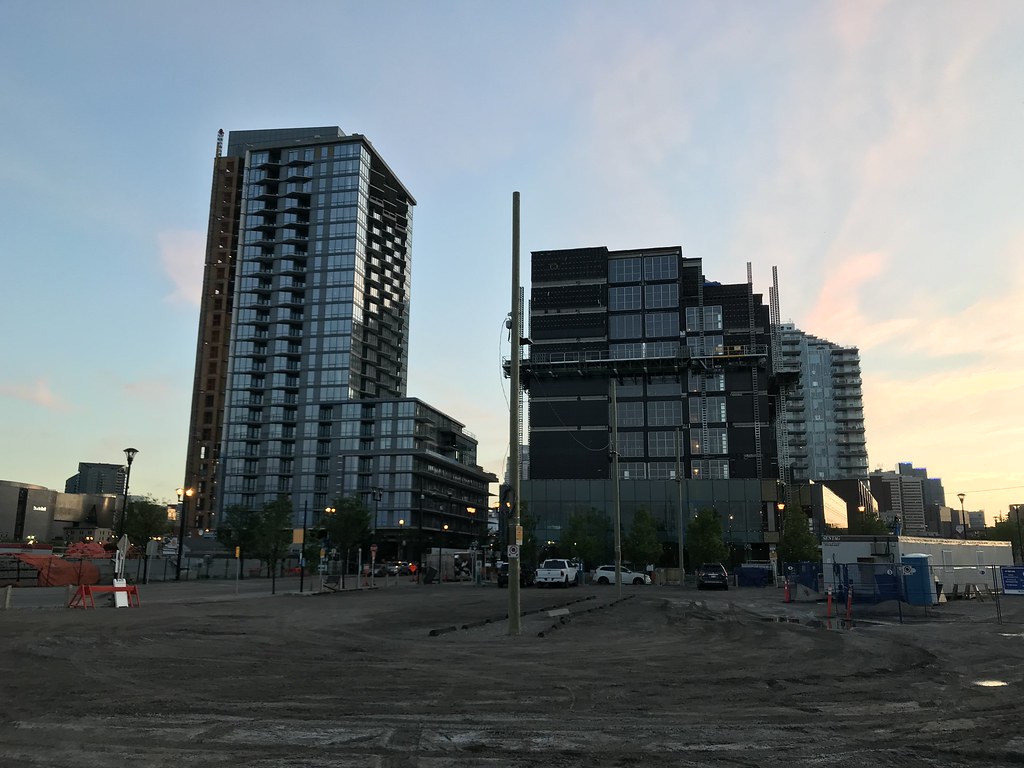
It is going to contrast amazingly with M2.
 
It's a box, but a great looking box. The form is super simple, but IMO contrasts nicely to the other architecture in EV

It's a solid, functional design. I wouldn't say it's great looking. I wish it was simplier and more of a box. The missing corner would have looked better filled in. My guess is that it would have cast shadows. Second would be the blank walls and the aluminum cladding. Brick would look better as is or painted with murals.
 
Pictures are two days old. Just my personal opinion but I absolutely love this building, I think it will turn out great.

41813740894_f157fc7fec_b.jpg


28663286458_8ba4844e90_b.jpg


28663279358_59017f3d94_b.jpg


28663296038_99af2499c5_b.jpg
 
Hi,
This Project is Starting to look really Great, Give it Time and it won't B so bad after all. Will B interested to see how the Rooms look in a few months time.
Hope they will allow Pictures of the Interiors.

Tnx,
Operater,
 
I like the patterned brick (?) they've installed along the pedestrian walkway between First and the hotel.
 
I still haven't made up my mind on this one. Such an amazing context deserves a building that acknowledges it. Construction was interesting, but it seems better suited for an infill along macleod or 16th ave. I'll hold my final comments until I see the main floor.
 

Back
Top