RyLucky
Active Member
This project somehow makes Bridgeland feel closer to downtown.
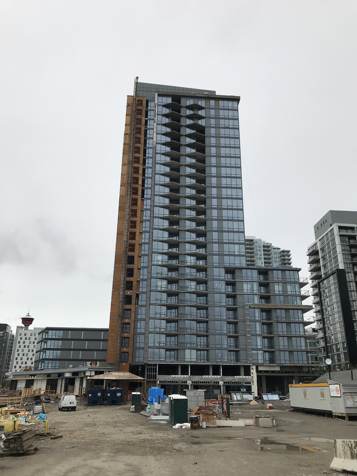
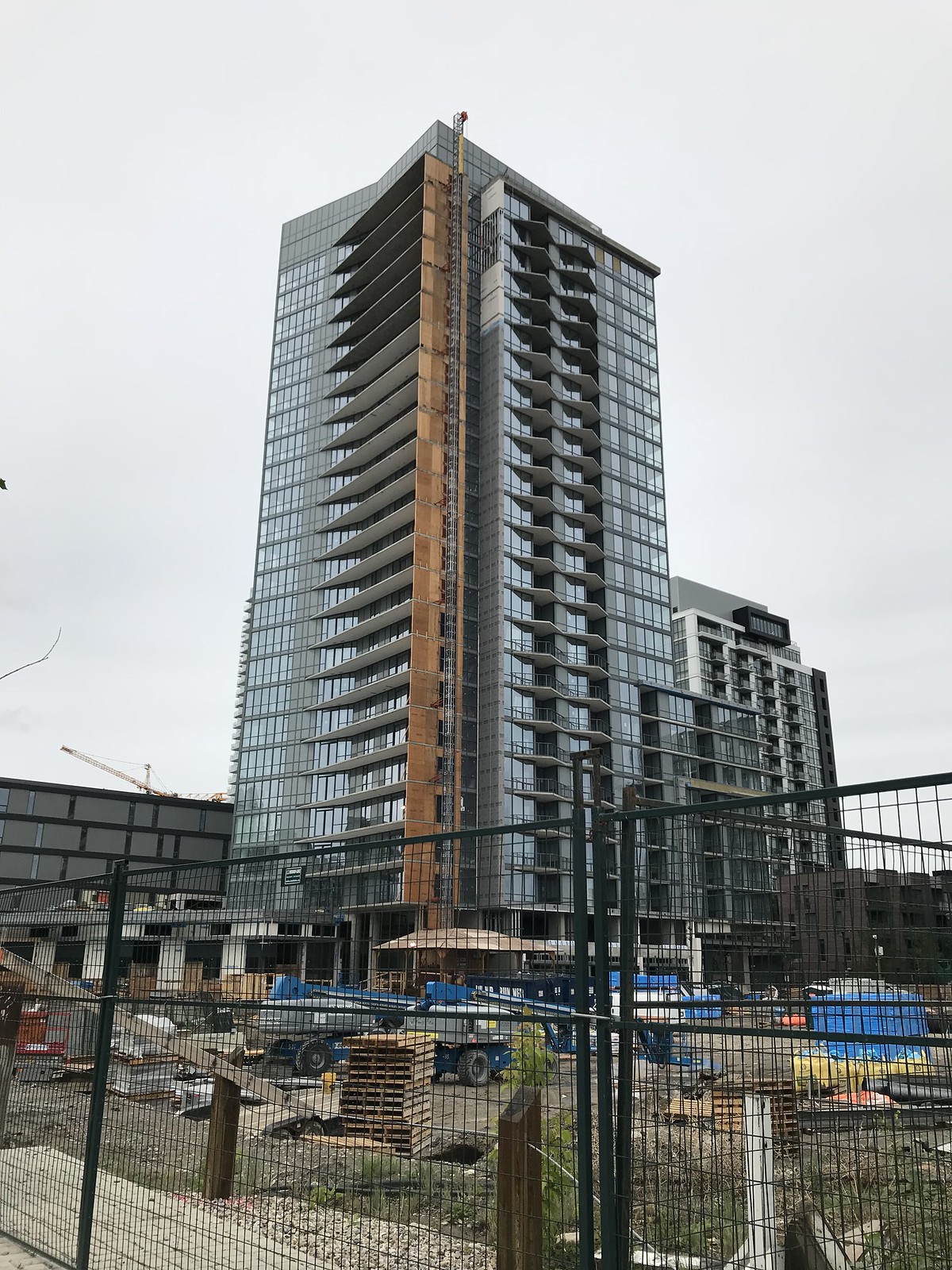
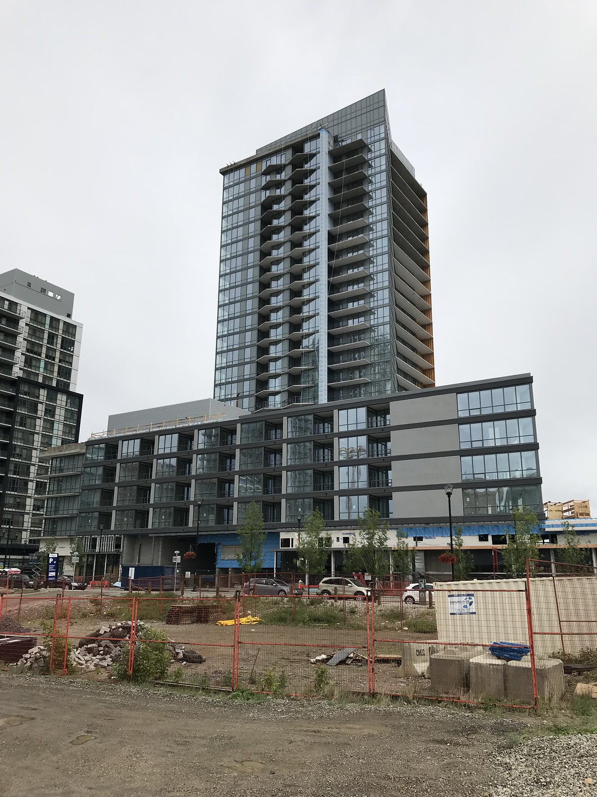
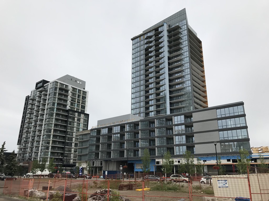
Between First, ALT Hotel, Verve, N3 and Hilton there sure are a lot of black and greys dominating the East Village skyline. Here's hoping we get some contrasting splashes of colour in the next round of construction. That being said, I do really like how Verve is turning out.
The amount of gray tones concerns me. EV has alot going for it, but diversity in color or materials is not one of them.Agreed, East Village could definitely use some colour.
I've been saying the same thing about the monochrome colour palette too, but in it's defence it is something that helps differentiate it from the rest of downtown and feel like it's own separate neighbourhood. No other part of Calgary really looks like that. On the flip side, I gave Ink high marks in my vote because it has considerably more colour than anything else.
Colour aside, I think Verve as a tower is exceeding my expectations. I really can't wait till both sides are done.
It is very Vancouver/Toronto in that way (probably a reflection of the major developers copying their well-tested designs from those cities). INK very intentionally went it's own route, and wasn't part of the EV development process in the same way as all the other condos (e.g. marketed independently), which has since been reflected in the outcome of being different.The quality in the EV developments may be good, but I still find it monochromatic also. Part of me hopes there is market slowdown and lull in new developments so as to have some different style buildings go up when the design trends change. I like INK for being different, and also the fact that it's not a large podium development. It's fine to have a few buildings with the large podiums, but I'd like to see more of the smaller individual buildings like INK.

