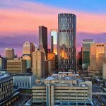
Sunnyside is on a roll! The nice thing about proposals in Sunnyside/Hillhurst is that even in a downturn they have a chance. The neighbourhood is desirable and the projects aren't large in scale.
You are using an out of date browser. It may not display this or other websites correctly.
You should upgrade or use an alternative browser.
You should upgrade or use an alternative browser.
General Construction Updates
- Thread starter Surrealplaces
- Start date
jdixon
Active Member
Looks like another project in the works for Sunnyside, close to the LRT and 10th Street:
https://developmentmap.calgary.ca/#property/LOC2017-0091
Still early days and just a land use application right now, but a DC based upon M-H1 would likely allow something of significant size. From the Land Use Bylaw:
Division 8: Multi-Residential – High Density Low Rise (M-H1) (M-H1f#h#d#) District
Purpose
635 The Multi-Residential – High Density Low Rise District:
(a) is intended to provide for Multi-Residential Development in the Developed Area and the Developing Area;
(b) has Multi-Residential Development that will provide development with higher numbers of Dwelling Units and traffic generation;
(c) provides for Multi-Residential Development in a variety of forms;
(d) has tall Multi-Residential Development with high density;
(e) has Multi-Residential Development where intensity is measured by floor area ratio to provide flexibility in building form and Dwelling Unit size and number;
(f) is intended to be typically located at community nodes and transit and transportation corridors and nodes;
(g) requires that Multi-Residential Development achieves a minimum density;
(h) includes a limited range of support commercial multi-residential uses, restricted in size and location within the building;
(i) provides outdoor space for social interaction; and
(j) provides landscaping to complement the design of the development and to help screen and buffer elements of the development that may have impacts on residents or nearby parcels.
Hmm appears to be the Dobbin Group. I think they teamed up with Battistella for Lido....
MichaelS
Senior Member
They also did the re-zoning for the 13 houses along memorial drive that Anthem is now planning their 90ish unit project on.
The Familia
Senior Member
So I recently went to Telus Spark for the first time since it opened. Man what a let down and huge disappointment that building is. I always envisioned science centres to be very unique buildings that are supposed to trigger creativity and imagination. This thing is literally the most sterile and boring box you can imagine.
The outside is literally gray sheet metal surrounded in some sort of silver perforated metal siding. There is no colour whatsoever and very little glass. it actually looks incomplete as I have no idea what the purpose of the metal perforated metal siding is for. It has no function from what I can tell.
The inside is just as bland and sterile. Nothing to invoke awe and wonder. It is basically an office building with some exhibits. Painfully corporate looking and nothing visually to look at. White and grey are the theme colours.
The exhibits themselves are rather boring and many are not functioning properly. The only decent thing was the theatre which has very good picture quality.
Overall I am not impressed and would never go back again. Waste of money. The old science centre was more visually appealing and actually looked ahead of its time and futuristic. This building doesn't even live up to the original bland renderings that at least had colour and a facade that changes appearance. I would honestly demolish this thing.
I'm not sure if the design is still the same but this is the Anthem project on Memorial.
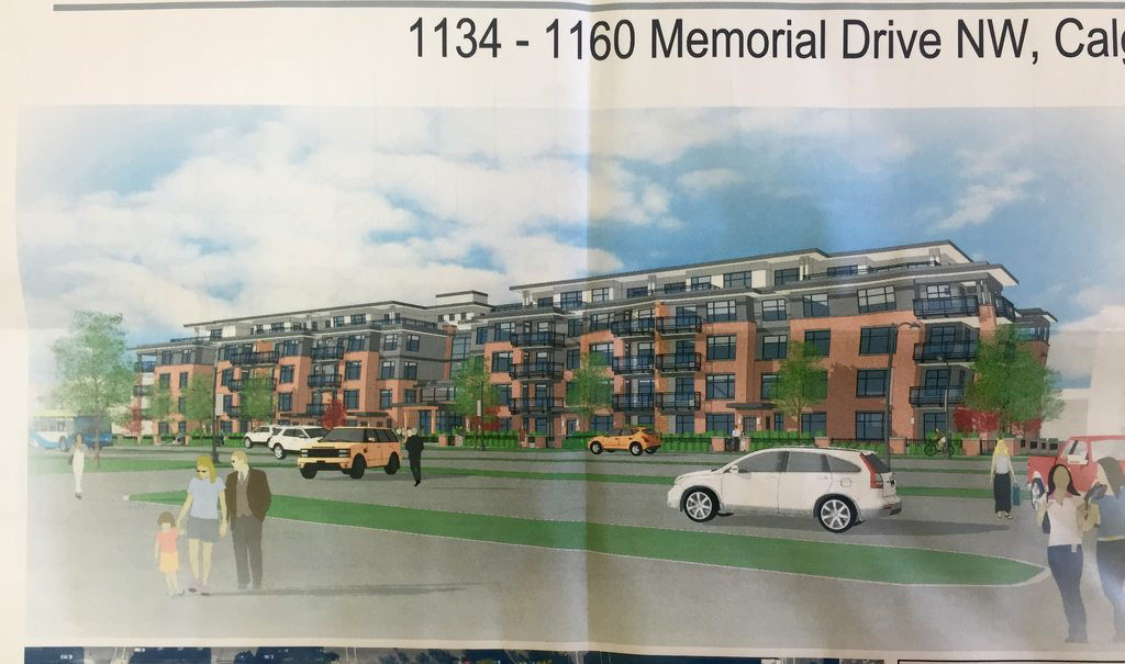
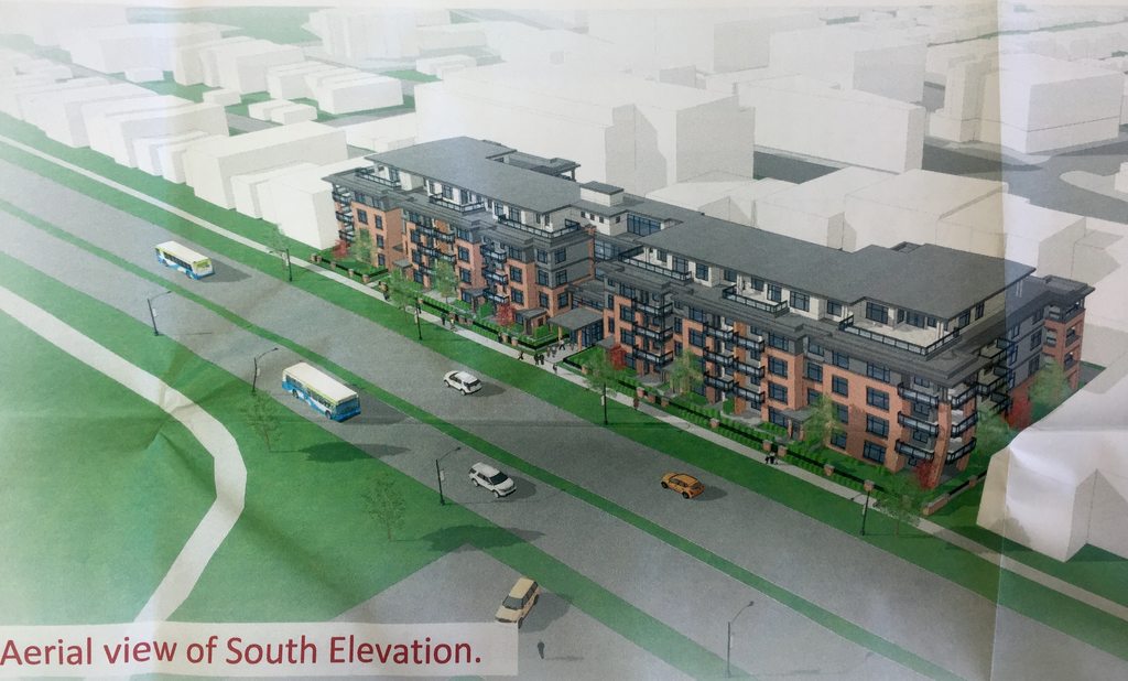
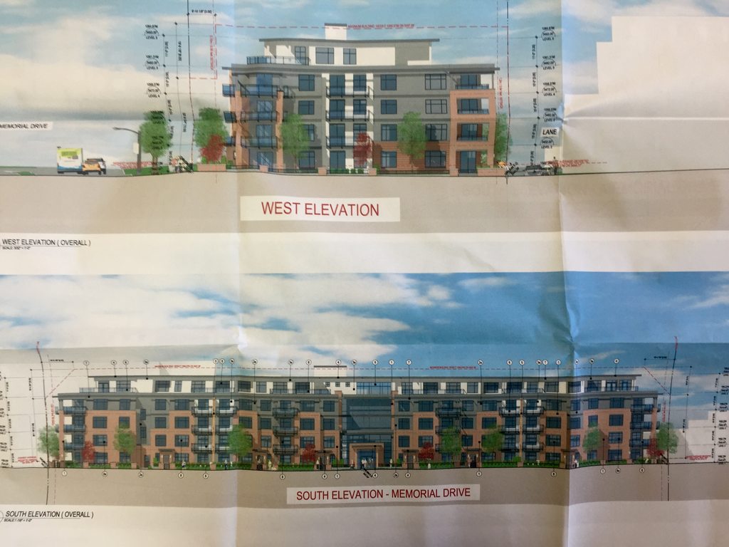
They also did the re-zoning for the 13 houses along memorial drive that Anthem is now planning their 90ish unit project on.
Attachments
Always_Biking
Senior Member
Nothing too fancy, but those rooftop terraces would be fantastic. both for views and ambiance.
BKha
Active Member
Decent proposal, nothing special, and it's a typical looking design of these days, but overall a nice addition to the area.
MichaelS
Senior Member
Redevelopment of Century Gardens Park is on the CPC agenda for next week. Item 5.2, starting on page 143. Not much else of interest though in the agenda. There are some colour renderings of the proposed park design:
http://www.calgary.ca/PDA/pd/Docume...ommission/agenda/2017/agenda-cpc-april-06.pdf
http://www.calgary.ca/PDA/pd/Docume...ommission/agenda/2017/agenda-cpc-april-06.pdf
CBBarnett
Senior Member
Old science centre was accessible too. This one doesn't even have a sidewalk to the LRT station. Terrible urban design all around. And we wonder why downtown vibrancy is an issue when we move destinations outside the core and make them completely inaccessible.So I recently went to Telus Spark for the first time since it opened. Man what a let down and huge disappointment that building is. I always envisioned science centres to be very unique buildings that are supposed to trigger creativity and imagination. This thing is literally the most sterile and boring box you can imagine.
The outside is literally gray sheet metal surrounded in some sort of silver perforated metal siding. There is no colour whatsoever and very little glass. it actually looks incomplete as I have no idea what the purpose of the metal perforated metal siding is for. It has no function from what I can tell.
The inside is just as bland and sterile. Nothing to invoke awe and wonder. It is basically an office building with some exhibits. Painfully corporate looking and nothing visually to look at. White and grey are the theme colours.
The exhibits themselves are rather boring and many are not functioning properly. The only decent thing was the theatre which has very good picture quality.
Overall I am not impressed and would never go back again. Waste of money. The old science centre was more visually appealing and actually looked ahead of its time and futuristic. This building doesn't even live up to the original bland renderings that at least had colour and a facade that changes appearance. I would honestly demolish this thing.
jdixon
Active Member
Much nicer than what's currently there!Redevelopment of Century Gardens Park is on the CPC agenda for next week. Item 5.2, starting on page 143. Not much else of interest though in the agenda. There are some colour renderings of the proposed park design:
http://www.calgary.ca/PDA/pd/Docume...ommission/agenda/2017/agenda-cpc-april-06.pdf
H.E.Pennypacker
New Member
That's a nice stretch of Memorial Drive redeveloped in one shot
Danpersand
New Member
Redevelopment of Century Gyouardens Park is on the CPC agenda for next week. Item 5.2, starting on page 143. Not much else of interest though in the agenda. There are some colour renderings of the proposed park design:
http://www.calgary.ca/PDA/pd/Docume...ommission/agenda/2017/agenda-cpc-april-06.pdf
Holy Cow. For the record, I am (or was) enthusiastic about an injection of life into this space. Not like this. While it has always been a unique, and occasionally weird spot to hang out in the core, time has obviously not been kind to some elements of the park. The always strange vertical log-wall/seating area along the northwest corner has begun to surrender to nature, decayed and moss covered, yet comforting in it's familiarity. The sections of the plank bridge walkway that have not been replaced heave and moan, perhaps reminding you of a simpler time, or that this might be the biggest risk you'll take all day and broken ankles eventually heal. It's all part of the charm.
Perhaps you'll sit a while and eat your shawarma, despite the occasionally dystopian atmosphere. A couple of magpies squabble over a pizza crust, a bottle picker kicks another in the balls in a Roll-Up-The-Rim cup dispute for the ages (free potato wedges). Someone, somewhere is screaming about Jesus. Commuters huddle for safety on the train platform, unable to avoid the constant 8th street echo, as familiar as the wind...gottasmoke?gottasmoke?gottasmoke?..and so on.
And yet, now comes the inevitable and obvious destruction of a truly public space. The foul stench that wafts down Stephen Avenue from the angry corpse of Devonian Gardens threatens to infect another downtown oasis. These renderings, preliminary as they may be, find me longing for the Calgary that was. It would be nice if the brutalist nature of the park could be retained, if only to remind us that ugly does not always mean bad.
What a shame.
Big update of various projects coming today 
UrbanWarrior
Senior Member
It looks like they're keeping the majority of the brutalist aspects of the park.
Oddball
Senior Member
So I recently went to Telus Spark for the first time since it opened. Man what a let down and huge disappointment that building is. I always envisioned science centres to be very unique buildings that are supposed to trigger creativity and imagination. This thing is literally the most sterile and boring box you can imagine.
The outside is literally gray sheet metal surrounded in some sort of silver perforated metal siding. There is no colour whatsoever and very little glass. it actually looks incomplete as I have no idea what the purpose of the metal perforated metal siding is for. It has no function from what I can tell.
The inside is just as bland and sterile. Nothing to invoke awe and wonder. It is basically an office building with some exhibits. Painfully corporate looking and nothing visually to look at. White and grey are the theme colours.
The exhibits themselves are rather boring and many are not functioning properly. The only decent thing was the theatre which has very good picture quality.
Overall I am not impressed and would never go back again. Waste of money. The old science centre was more visually appealing and actually looked ahead of its time and futuristic. This building doesn't even live up to the original bland renderings that at least had colour and a facade that changes appearance. I would honestly demolish this thing.
Sadly I'm right there with you. I had a similar experience 2-3 years ago and haven't been back since. There wasn't even anything particularly scientific going on at the science centre from what I could see.
