This list on the front page of the office conversion thread has been updated. If anyone sees anything missing or incorrect, let me know.
You are using an out of date browser. It may not display this or other websites correctly.
You should upgrade or use an alternative browser.
You should upgrade or use an alternative browser.
Urban Development and Proposals Discussion
- Thread starter Surrealplaces
- Start date
Chowda7
Active Member

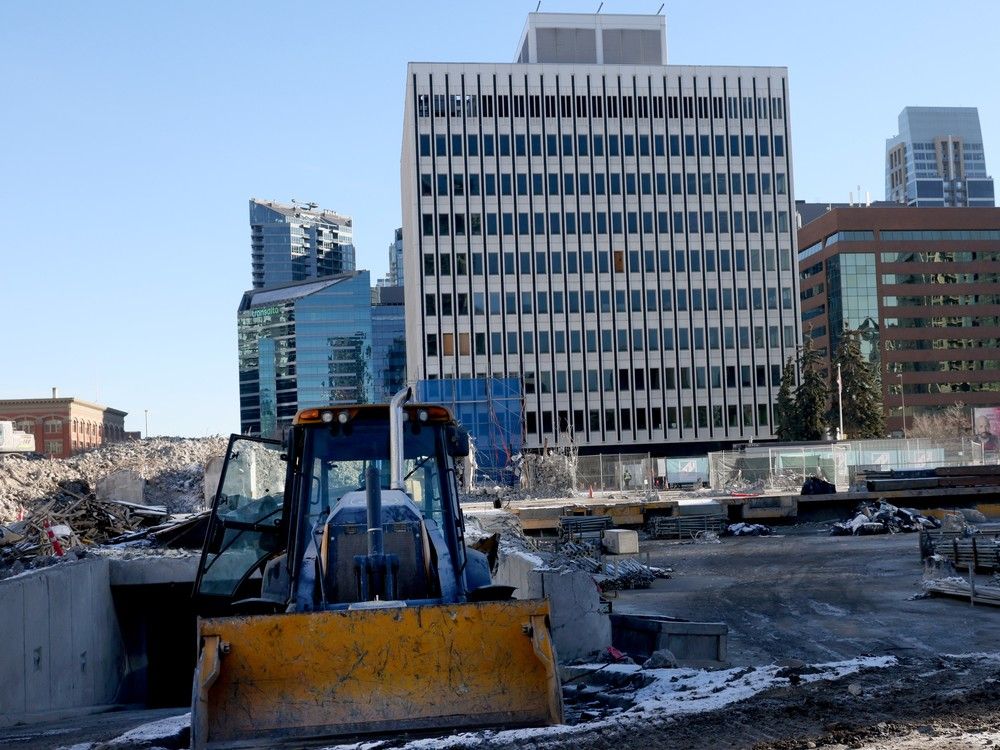
City announces nine additional downtown office conversion projects
The City of Calgary increasing effort to convert 6 million square feet of vacant downtown office space into residential and commercial uses.
JCS101
New Member
Can we add 1207 11th ave SW. https://impeccable-interiors.ca/project/connaught-centre/This list on the front page of the office conversion thread has been updated. If anyone sees anything missing or incorrect, let me know.
CallmeCatbread
Active Member
HOLY SHIT WHATYou will like that fact that Allies and Morrison is working on a project here in Calgary. It will be announced soon.
Allies and Morrison is one of the best multifamily architects on the freaking planet there is no way we're getting a project from them
Last edited:
rkarsk
New Member
Really have to disagree with you on this one. Calgary is already too segregated from a land use perspective. Having offices along retail corridors brings bodies in to support breakfast, lunch and general daytime activity so business don't have to only rely on the 6pm+ crowd to survive. If anything, 17th would benefit from more office space throughout.I would love to see office to residential conversions along 17th Ave. So many empty and struggling office buildings that would be great conversion candidates for condos or boutique hotels.
Some candidates below.
KensingtonLurker
New Member
I think that 500 5 Ave SW, Chevron Building, is missing. That's another 332 units.This list on the front page of the office conversion thread has been updated. If anyone sees anything missing or incorrect, let me know.
Another one that was completed in 2021 would be The Westley Hotel at 640 4 Ave SW. It has 104 rooms.
Mountain Man
Senior Member
An office to hotel conversion on 17th would be money!
darwink
Senior Member
Yes!boutique hotels.
I've updated the list some more. I'm pasting it here so people can have a look in case they haven't seen it in the other thread.
| Name | Status | # Units/Rooms | Opened/Opening | Notes | Developer | ||
| 1 | Westley Hotel | Completed | 104 | 2022 | Hotel | ||
| 2 | Cube | Completed | 65 | 2020 | Strategic | ||
| 3 | Sierra Place | Completed | 108 | 2022 | Homespace | ||
| 4 | Cornerstone | Completed | 112 | 2024 | Including below-market and accessible | Peoplefirst | |
| 5 | The Hat Eau Claire | Completed | 87 | 2025 | Cidex | ||
| 6 | HAT @ NINTH | Completed | 108 | 2025 | Teck Place | Cidex | |
| 7 | The Loft | Completed | 56 | 2025 | Institutional Mortgage Capital | ||
| 8 | Dominion Centre | In Progress | 122 | 2025 | Including below-market | Alston Properties | |
| 9 | Place 800 | In Progress | 204 | 2026 | Including below-market | Peoplefirst | |
| 10 | Taylor Building | In Progress | 83 | 2026 | Cressey | ||
| 11 | The Barron | In Progress | 94 | No posted date | Strategic | ||
| 12 | Petro Fina | Completed | 103 | 2025 | Including below-market | Astra Group/People First | |
| 13 | Eau Claire Place II | In Progress | 195 | 2025 | Pacific Reach | ||
| 14 | Palliser One | In Progress | 418 | 2027 | Including below-market | Aspen Properties | |
| 15 | Hannover Building | In Progress | 264 | No posted date | Cairo Developments | ||
| 16 | Joffre Place | In Progress | 119 | 2026 | Alston Properties | ||
| 17 | Element Hotel | Completed | 226 | 2025 | Hotel | PBA Land Development | |
| 18 | 110 - 12 Ave (Former Transalta) | In Progress | 153 | ||||
| 19 | University of Calgary ( former Nexen bldg) | In Progress | 2027 | Campus for 1,200 students. | U of C | ||
| 20 | 606 4th Street | Planning | Dream Office REIT | ||||
| 21 | The HAT @ 5 Ave | Planning | 32 | Cidex | |||
| 22 | 510 5th | Planning | 128 | Bluevale Capital | |||
| 23 | 441 Fifth | Planning | 63 | Bluevale Capital | |||
| 24 | Atrium Residences | Planning | 180 | Astra Group/People First | |||
| 25 | Epique House | Planning | 35 | Alston Properties | |||
| 26 | Wicked Hostel | Planning | Hotel | Bryan Mar & Axiz Associates | |||
| 27 | 640 5th | Planning | 262 | Kanas | |||
| 28 | Aurora Residence | Planning | 92 | ||||
| 29 | Chevron Building | Planning | 332 |
Thrillhou
Active Member
I don't think I've seen this one posted yet. Corner of Centre Street and 19th ave NE
https://dmap.calgary.ca/?p=DP2025-06335

https://dmap.calgary.ca/?p=DP2025-06335
IanBray
Active Member
Almost all of them have had 'For Lease' banners up on them for years. No one wants to lease 1980s Class C office space whether its downtown, Beltline or 17th Ave.Are those empty/struggling? I know large spaces downtown aren't being leased, but these are neither downtown nor large.
Disraeli
Active Member
Missing the Minto International Hotel conversion which is 200+ units.I've updated the list some more. I'm pasting it here so people can have a look in case they haven't seen it in the other thread.
Name Status # Units/Rooms Opened/Opening Notes Developer 1 Westley Hotel Completed 104 2022 Hotel 2 Cube Completed 65 2020 Strategic 3 Sierra Place Completed 108 2022 Homespace 4 Cornerstone Completed 112 2024 Including below-market and accessible Peoplefirst 5 The Hat Eau Claire Completed 87 2025 Cidex 6 HAT @ NINTH Completed 108 2025 Teck Place Cidex 7 The Loft Completed 56 2025 Institutional Mortgage Capital 8 Dominion Centre In Progress 122 2025 Including below-market Alston Properties 9 Place 800 In Progress 204 2026 Including below-market Peoplefirst 10 Taylor Building In Progress 83 2026 Cressey 11 The Barron In Progress 94 No posted date Strategic 12 Petro Fina Completed 103 2025 Including below-market Astra Group/People First 13 Eau Claire Place II In Progress 195 2025 Pacific Reach 14 Palliser One In Progress 418 2027 Including below-market Aspen Properties 15 Hannover Building In Progress 264 No posted date Cairo Developments 16 Joffre Place In Progress 119 2026 Alston Properties 17 Element Hotel Completed 226 2025 Hotel PBA Land Development 18 110 - 12 Ave (Former Transalta) In Progress 153 19 University of Calgary ( former Nexen bldg) In Progress 2027 Campus for 1,200 students. U of C 20 606 4th Street Planning Dream Office REIT 21 The HAT @ 5 Ave Planning 32 Cidex 22 510 5th Planning 128 Bluevale Capital 23 441 Fifth Planning 63 Bluevale Capital 24 Atrium Residences Planning 180 Astra Group/People First 25 Epique House Planning 35 Alston Properties 26 Wicked Hostel Planning Hotel Bryan Mar & Axiz Associates 27 640 5th Planning 262 Kanas 28 Aurora Residence Planning 92 29 Chevron Building Planning 332
That's new to me. I like it. Just the kind of building Centre Street could use a hundred more of.I don't think I've seen this one posted yet. Corner of Centre Street and 19th ave NE
https://dmap.calgary.ca/?p=DP2025-06335
View attachment 697524
Last edited:
Office conversion list updated again and I think this should be up to date now. The thing that really struck me was the total number of residential units at 3605. It's like building around 10-12 x 30 storey residential towers around the core.
| Name | Status | # Units/Rooms | Opened/Opening | Notes | Developer | ||
| 1 | Westley Hotel | Completed | 104 | 2022 | Hotel | ||
| 2 | Cube | Completed | 65 | 2020 | Strategic | ||
| 3 | Sierra Place | Completed | 108 | 2022 | Homespace | ||
| 4 | Cornerstone | Completed | 112 | 2024 | Including below-market and accessible | Peoplefirst | |
| 5 | The Hat Eau Claire | Completed | 87 | 2025 | Cidex | ||
| 6 | HAT @ NINTH | Completed | 108 | 2025 | Teck Place | Cidex | |
| 7 | The Loft | Completed | 56 | 2025 | Institutional Mortgage Capital | ||
| 8 | Dominion Centre | Completed | 122 | 2025 | Including below-market | Alston Properties | |
| 9 | Place 800 | In Progress | 204 | 2026 | Including below-market | Peoplefirst | |
| 10 | Taylor Building | In Progress | 83 | 2026 | Cressey | ||
| 11 | The Barron | In Progress | 94 | No posted date | Strategic | ||
| 12 | Petro Fina | Completed | 103 | 2025 | Including below-market | Astra Group/People First | |
| 13 | Eau Claire Place II | In Progress | 195 | 2025 | Pacific Reach | ||
| 14 | Palliser One | In Progress | 418 | 2027 | Including below-market | Aspen Properties | |
| 15 | Hannover Building | In Progress | 264 | No posted date | Cairo Developments | ||
| 16 | Joffre Place | In Progress | 119 | 2026 | Alston Properties | ||
| 17 | Element Hotel | Completed | 226 | 2025 | Hotel | PBA Land Development | |
| 18 | 110 - 12 Ave (Former Transalta) | In Progress | 153 | ||||
| 19 | University of Calgary ( former Nexen bldg) | In Progress | n/a | 2027 | Campus for 1,200 students. | U of C | |
| 20 | 606 4th Street | In Progress | 166 | Dream Office REIT | |||
| 21 | The HAT @ 5 Ave | Planning | 32 | Cidex | |||
| 22 | 510 5th | Planning | 128 | Bluevale Capital | |||
| 23 | 441 Fifth | Planning | 63 | Bluevale Capital | |||
| 24 | Atrium Residences | Planning | 180 | Astra Group/People First | |||
| 25 | Epique House | Planning | 35 | Alston Properties | |||
| 26 | Wicked Hostel | In Progress | 28 | Hotel | Bryan Mar & Axiz Associates | ||
| 27 | 640 5th | Planning | 262 | Kanas | |||
| 28 | Aurora Residence | Planning | 92 | ||||
| 29 | Chevron Building | Planning | 332 | Strategic | |||
| 30 | Missao Building | Completed | 24 | 15th and 16th floor converted to 24 units | Strategic | ||
| 358 | Total Hotel | ||||||
| 3605 | Total Residential |
adamyyc
Senior Member
The City is seeking feedback on their three concepts for the Sunalta Main Street:


