Robo
New Member
It’s looking good, I’m happy with it.
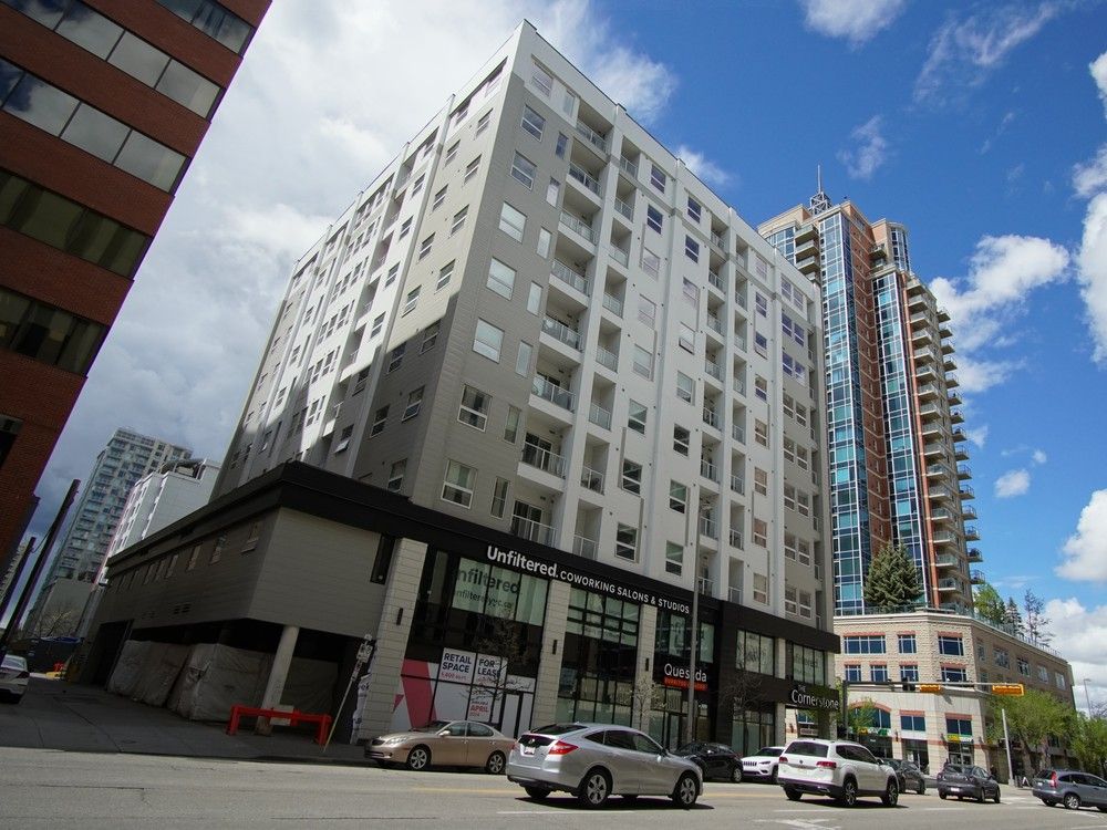
Wouldn't you agree though that once the balconies were added, it essentially wiped away the seamlessness that made the bullions and 2 toned blue glass work. The fact they kept the arches and larger vertical strips, id' say that's a win in trying to achieve a somewhat timeless and modern design, while respecting what was there.While there are definitely positives about this development, I would have loved to see a little more care and consideration on the design side. I don't think it would've broken the bank to add back
some of those mullion strips, and perhaps go with a glass color that is a nod to it's mid-century roots. It doesn't necessarily have to be either/or with these projects...you can have a nice new conversion while still respecting history.
This conversion actually doesn’t look half bad.

Yeah its been a month, some French artist did that.Looks like they've also repainted the mural on the underpass.
Sacre bleu!Yeah its been a month, some French artist did that.

The third project as Sierra and Cornerstone were finished before this one.Perhaps this conversion will be the 2nd completed project from the first round of funding offered by the city.

As Calgary's office conversion program reopens, initial projects remain under construction
Experts say that while it’s unclear whether the program has been a success, the city isn’t wrong to forge onward with a new round of fundingcalgaryherald.com