That's my concern too. It's plain, but I tend to like plain more than something that's overdone.I don't really like this one but careful what you wish for HSCA.
You are using an out of date browser. It may not display this or other websites correctly.
You should upgrade or use an alternative browser.
You should upgrade or use an alternative browser.
The Theodore | 35.66m | 10s | Graywood | Arcadis
- Thread starter Surrealplaces
- Start date
Urb
Active Member
Looks like something you’d see in Shawnessy. Very mediocre for a prime inner city location. I’m with the CA on this one.
Always_Biking
Senior Member
I agree it could be better, but I'm not with the CA on this one. I don't think the CA knows what good design is, and if they keep pushing for the changes they want I'm betting it'll end up worse instead. It seems like they want more detail, but I don't think it needs it, and I don't think the materials are bad. My only real complaint is the color of the brick. I would change the color from pink/salmon, to either light gray, black or very light beige.Looks like something you’d see in Shawnessy. Very mediocre for a prime inner city location. I’m with the CA on this one.
Beltline_B
Senior Member
I’m pretty sure you won’t find anything this good in Shawnessy, but I get your point. I like the street treatment on this one, which is the most important factor for me. Colour scheme could be better.
Looks like something you’d see in Shawnessy. Very mediocre for a prime inner city location. I’m with the CA on this one.
BKha
Active Member
Agreed.Looks like something you’d see in Shawnessy. Very mediocre for a prime inner city location. I’m with the CA on this one.
maestro
Senior Member
From the community association pre-engagement feedback on the DP:
"The materiality is very bland and non-impactful. The combination of white panels throughout and cream- coloured stone creates a very large façade that is completely void of contrast and visual interest. We understand that the use of the high-quality white metal panels you have suggested can be successful, as is illustrated in some of your provided precedents. However, these precedent projects all incorporate some elements which create a more dynamic design including: articulation and undulation of the building form, strategic use of additional colours and materials, and inclusion of other textural items such as screens and strategic use of mullions on windows. Without some kind of additional elements, the effect of these materials is lost, and the building design becomes boring instead of memorable."
HSCA Pre-Application Comments
I agree however this, more dynamic design including: articulation and undulation of the building form, strategic use of additional colours and materials, and inclusion of other textural items such as screens and strategic use of mullions on windows, scares the hell out of me.
That's my worry. The architect will tack on a bunch of unnecessary items just to please the CA, and end up with something worse.I agree however this, more dynamic design including: articulation and undulation of the building form, strategic use of additional colours and materials, and inclusion of other textural items such as screens and strategic use of mullions on windows, scares the hell out of me.
angstorm
New Member
I didn't read it this way that they were asking for those specific items: they are saying the precedent buildings in the Graywood presentation had examples of "more dynamic design including: articulation and undulation of the building form, strategic use of additional colours and materials, and inclusion of other textural items such as screens and strategic use of mullions on windows." After the DP stage, it's doubtful how much impact the CA has in making changes.
angstorm
New Member
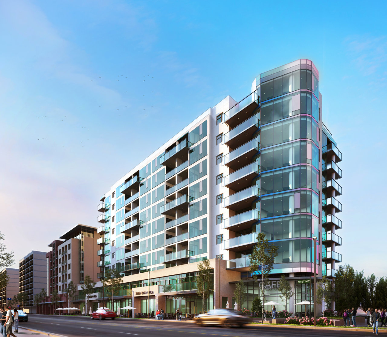
New rendering up:

Urb
Active Member
Nice find. Has an Art Deco feel to it. Miami Vice anyone?
I like it better than the old rendering. Stick with the white and maybe change the glass to light gray instead of green, and I really like it. Even the green glass is fine, adds some variety to Kensington.
Mountain Man
Senior Member
Not bad, much better than the previous version (though it's still kinda beige). 10St is achieving some really great density these days!
haltcatchfire
Senior Member
Praise the lord. Much better.
AccUnit
Active Member
I like the new rendering. Great way to end the street.
zagox
Active Member
Not bad, much better than the previous version (though it's still kinda beige). 10St is achieving some really great density these days!
I’ve heard a rumour that a number of businesses on the east side of 10th st, including Midtown Kitchen have not been able to extend their leases because there is a new owner that is planning redevelopment. Anyone else heard that?