The Fifth | 17m | 5s | Arlington Street | NORR

With less equipment out front:
16390845964533624923584488902098.jpg
 
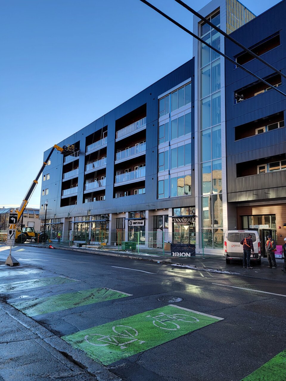
The black really doesn't suit this one, especially with the large blank wall space between the windows and balconies on the east side. White would've been a better color of choice. I still think a big vertical LED sign or an electronic billboard would've fit in nicely in between that space. Maybe they can consider a mural down the line.
 
Besides the bad materials, the windows on the east side appear to be too small and old looking. Also, I'm gonna guess the black smooth surface will appear very dirty after 1 year.
All around disaster. Don't we have a counsel or an architect in public office whose job it is to send architectural firms like NORR back to the drawing board and reject hideous projects like this? I think they just get too excited for any new development.
 
To be fair, I think the broader almost large shingle like black siding that was shown in all of the renderings would have improved the look of the building. Had they stuck to the original design plan a shown in the render I think the building would have looked a bit better but instead we got a bit of a bait and switch.
 
Besides the bad materials, the windows on the east side appear to be too small and old looking. Also, I'm gonna guess the black smooth surface will appear very dirty after 1 year.
All around disaster. Don't we have a counsel or an architect in public office whose job it is to send architectural firms like NORR back to the drawing board and reject hideous projects like this? I think they just get too excited for any new development.
We do, sort of. There is the Urban Design Review Panel, and also the City has a Chief Urban Designer (who is quite excellent BTW). The problem is, these authorites are not given very strong authority, most often (always?) being advisory I think.
 
This one is just ironic for me. It tries so hard to not be clunky - with things like the balcony insets, white cladding, recessed ground floor, glazed elevator shaft - but it still ends up there anyway.

If it were me, I would have just embraced that this is a characteristically strong corner and designed the building to embody that. Use brick/stone, traditional proportion, and incorporate modernism in different and more subtle ways. I love contemporary architecture, but for some reason this brand of modernism has such a spite of building materials and proportions that have stood the test of time. We'll never know if it's ego or cost constraints (probably the latter), but what we got just looks so temporary.

Thank god for good retail tenants and wide sidewalks.
 

Back
Top