Mountain Man
Senior Member
More of this please!

I would say so. So far only a land use change, but given the website launch, it wouldn't surprise me to see a DP sometime soon.Is that still the conceptual design?

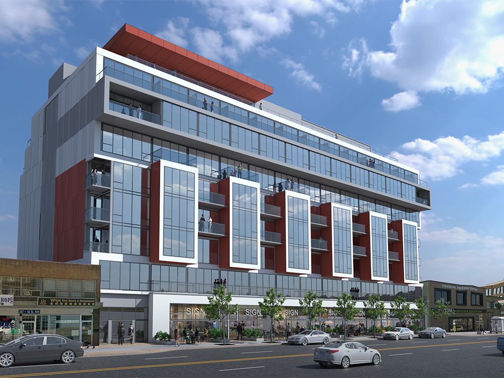
This looks fantastic, I love it. Wish there was this kind of density all over Calgary.Rendering for this one now available, per David Parker article:
View attachment 252342
Parker: SOLA in Kensington to kickstart improvements to 14th Street N.W.
There has been little change to 14calgaryherald.com