ActiveTruth
Active Member
Better then nothingI like the way it looks also. Whether it was needed or not is another story, but I think it looks cool.
Better then nothingI like the way it looks also. Whether it was needed or not is another story, but I think it looks cool.
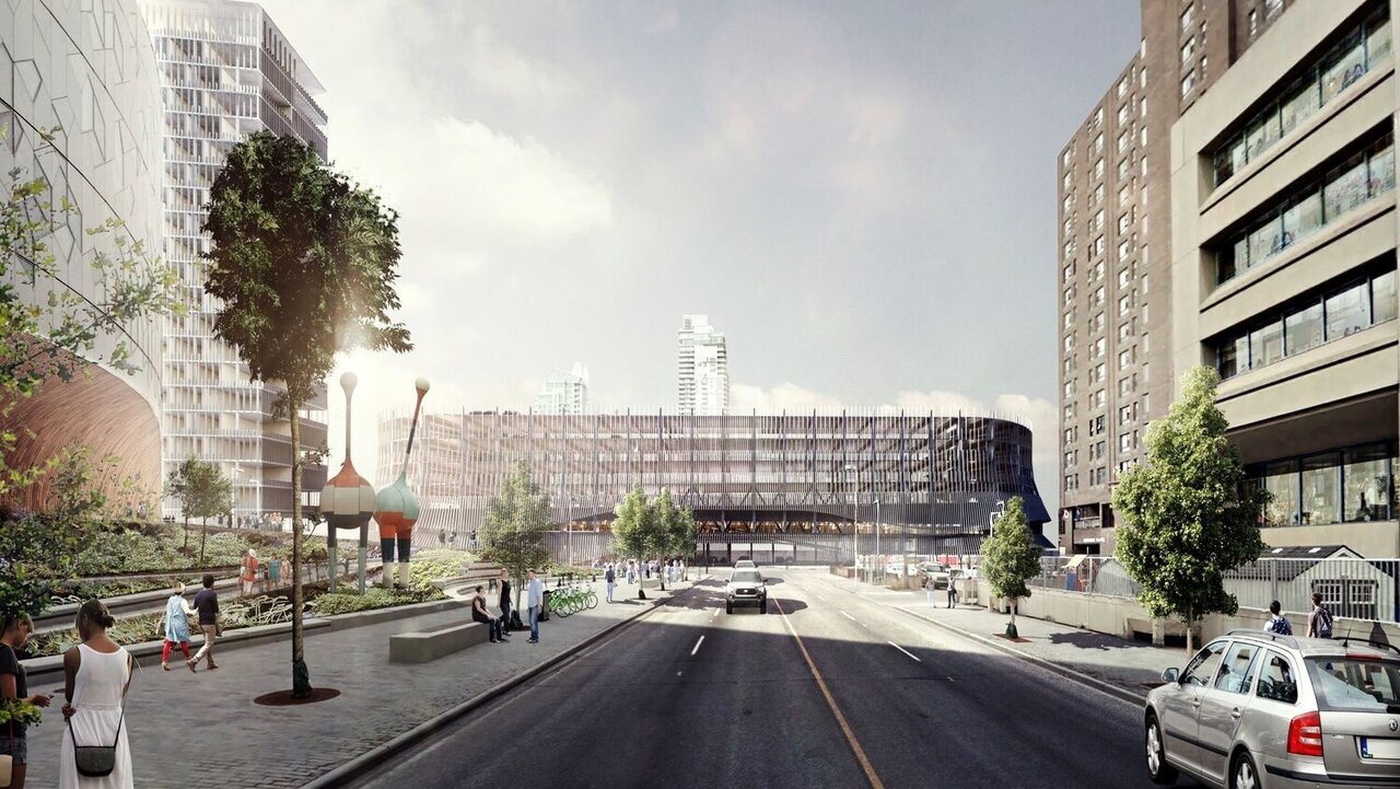
Do you know that this will be happening? I believe it will as well, or is this tubing the finished product?Once they fill in the skirt/screen, I think this will look much better.
More like, the rendering versus the finished productPlatform's kind of rockin the Darth Vader look.
The updated rendering appears to show that this is pretty close to the finished product. There's not going to be a mesh covering the pipes. And they're not going to be adding more pipes to the upper levels. The upper levels basically match the updated renderings at this point.It's not the finished product though...

I know everyone hates PoMo/historicism, but I actually kinda like this building. It's definitely the least oppressive looking parking garage downtown. You can certainly find many worse examples of 1990s PoMo around.I can't help but wonder how I'd react if instead we just got another one of these buildings:
View attachment 318088