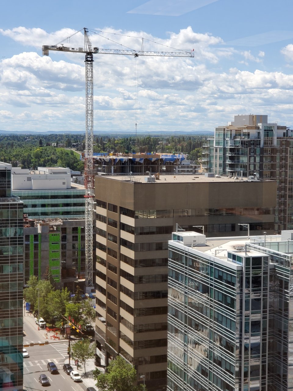
I'm reserving judgement until the white balconies go up.
You are using an out of date browser. It may not display this or other websites correctly.
You should upgrade or use an alternative browser.
You should upgrade or use an alternative browser.
Park Central | 138m | 40s | Hines | S.C.B.
- Thread starter Surrealplaces
- Start date
maestro
Senior Member
There's not much one can say about grey spandrel. It's better than browns and beige? There's still hope with the other cladding but, as usual, I'm not feeling as optimistic as you guys. You probably will continue using cheap and ordinary for the rest of the tower.
Always_Biking
Senior Member
I'm not a fan of the gray spandrel on the tower, but the silver lining in all of this is the podium looks good so far and that's mostly what will be noticed at the street level.
maestro
Senior Member
The podium has good scale and nice high ceilings for the commercial. If only they used a darker coloured mullion cap for the podium's window wall.
1875
Senior Member
drove by here a couple times today from different angles, i dont get the hate on for the grey. is this much different than the royal?
Last edited:
I don't hate the tone, but I don't like how the windows are arranged. It looks like about 50% panel. Even if it was a bit less it would make a difference. I don't hate it, but not loving it. I still think the white balconies will look sharp against the gray.
1875
Senior Member
im thinking that might not be how the whole project turns out. could be specific to the floor and floorplan. the whole south side aside from the corner is all window. the east side is looking directly into another building so maybe thats why its light on windows.
lumen-refund
New Member
GoVertical
Senior Member
The siding reminds me a lot of 6th and 10th
1875
Senior Member
UrbanWarrior
Senior Member
GoVertical
Senior Member
Almost eclipsing Castello:
