The Fifth | 17m | 5s | Arlington Street | NORR

Surrealplaces

Administrator
Staff member
Member Bio
Joined
Sep 24, 2015
Messages
13,450
Reaction score
79,531
Location
Calgary
New rendering I haven't seen before for that 5th street project. Waves is now closed, so maybe construction is imminent.
28847-112738.jpg


the5th-1.jpg


================================
Previous renderings
I like the massing of this one, and like the retail on 5th. ...love the rooftop deck. The thing that bothers me is the number of materials...6 different types from my count.

1766.jpg 1767.jpg 1768.jpg 1769.jpg 1765.jpg
 

Attachments

  • 1766.jpg
    1766.jpg
    193.5 KB · Views: 782
  • 1767.jpg
    1767.jpg
    233.1 KB · Views: 753
  • 1768.jpg
    1768.jpg
    259.2 KB · Views: 766
  • 1769.jpg
    1769.jpg
    180.7 KB · Views: 735
  • 1765.jpg
    1765.jpg
    264.8 KB · Views: 775
  • 28847-112738.jpg
    28847-112738.jpg
    226.1 KB · Views: 2,740
  • the5th-1.jpg
    the5th-1.jpg
    578.8 KB · Views: 2,628
Last edited:
New rendering I haven't seen before for that 5th street project. Waves is now closed, so maybe construction is imminent.

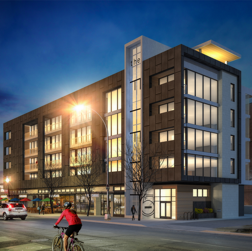
I like the massing of this one, and like the retail on 5th. ...love the rooftop deck. The thing that bothers me is the number of materials...6 different types from my count.
View attachment 121368
Street level retail looks better than the photo they've been floating around for a while before this.
 
Is the sidewalk/curb change at 5th and 17th that they have shown actually going to happen or is that something they have simply put into the renderings? As for the building, I really hope they scale back the mashup of materials.
 
I like it, but I'll agree with the pack and say the material choices are overly busy. I also pray they also rename this thing. Calling it the Fifth would be an achievement in unoriginality.

Which gives me an idea, maybe we should give out annual awards for bad or bland design in the city. Sort of like a civic Razzie. We could call them the Beigies. :p

We could have:

Worst Name
Worst Render/Proposal
Worst Art Component
Worst Value Engineering
Worst Indefinite Hiatus
Worst Completed Public Project (City of Calgary, Province, Federal, CBE, etc.)
Worst Completed Private Project (corporations, not-for-profit, independent instutions, etc.)
 
Last edited:
Bizarro Opinion:

Maybe we're all just seeing it wrong. Maybe the image has been normalized and the background distorted, such that when the back ground is undistorted the actual design is a melted Gaudi-esque masterwork and this is just their way of camouflaging it from the unwashed masses. (for the record, I don't wash :p)

IRL-Opinion:

I like the height, I like the blocky modern shape and I like that it extends the pedestrian friendly street level environment up 5th Street. What I don't like is the mish-mash of materials which result in the aesthetic of the project becoming reminiscent of an unholy marriage between Vantage Pointe and a cheap sub-urban home circa 2007.
 
Looking at the larger renderings close-up, I like the materials better....at least each individually. Still too many styles into one design. As someone pointed out the orange-like colors look like Prodema, which makes the multitude of colors more palatable.
I like the massing, it's good for a tricky site like that.
 
Is the sidewalk/curb change at 5th and 17th that they have shown actually going to happen or is that something they have simply put into the renderings? As for the building, I really hope they scale back the mashup of materials.

I believe so yes. During Bacon Fest last year, Rollin Stanley mentioned that this project will get rid of the weird cross walk that currently exists.
 
I wish this project included demolition of the run down apartment building next door. As for the design, it's not great. The City needs to be pushing these developers for better proposals on prominent streets like 17th Ave. This looks like it belongs in Copperfield Park. Materials appear to include bland vinyl siding...
 
I wish this project included demolition of the run down apartment building next door. As for the design, it's not great. The City needs to be pushing these developers for better proposals on prominent streets like 17th Ave. This looks like it belongs in Copperfield Park. Materials appear to include bland vinyl siding...
The materials make it look like it could be in a place like Copperfield, but the overall shape and functionality is good. I agree about pushing developers for projects on streets like 17th ave, 4th street, 9th ave in Inglewood etc..
 
- Good massing and mix of uses for this location. I'd like to see the parkade layout for this one - looks like a proforma killer.
- Hopefully the Urban Design Review Panel rips these guys a new one. With exception of the ground level, this looks like a suburban Holiday Inn.
 
- Good massing and mix of uses for this location. I'd like to see the parkade layout for this one - looks like a proforma killer.
- Hopefully the Urban Design Review Panel rips these guys a new one. With exception of the ground level, this looks like a suburban Holiday Inn.
For me it's the colours. Change some of those materials and it's a nice little building.
 

Back
Top