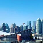
Co-op Midtown - 11 Avenue SW between 10 and 11 Streets SW
This one was inspired by the conversation in this thread
16 Avenue NE Co-op redevelopment thread. In that thread there was lots of good discussion about what does it mean to design urban, is it even possible on such an auto-oriented street, grocery store design etc. Let's explore everyone's go-to urban grocery and apparent development attractor for thousands of high-density Beltline units in the past decade, Co-op Midtown. It's a bit different case that some of the previous examples as it's a mix of public and private space, but has many lessons in pedestrian and public realm to explore.
Context: red arrows are the vehicle access ramps, blue circle is the entrance. There are 4 access points for vehicles, and one access to the Vantage Pointe garage off 10 Street SW.The grocery store and tower were built in 2003 and 2004, before many of the other redevelopments in the area. Previously the block operating as a vehicle storage lot for ATCO (I think) and had a few light industrial buildings. Prior to that (e.g. 1940s/50s) there were houses on the block.
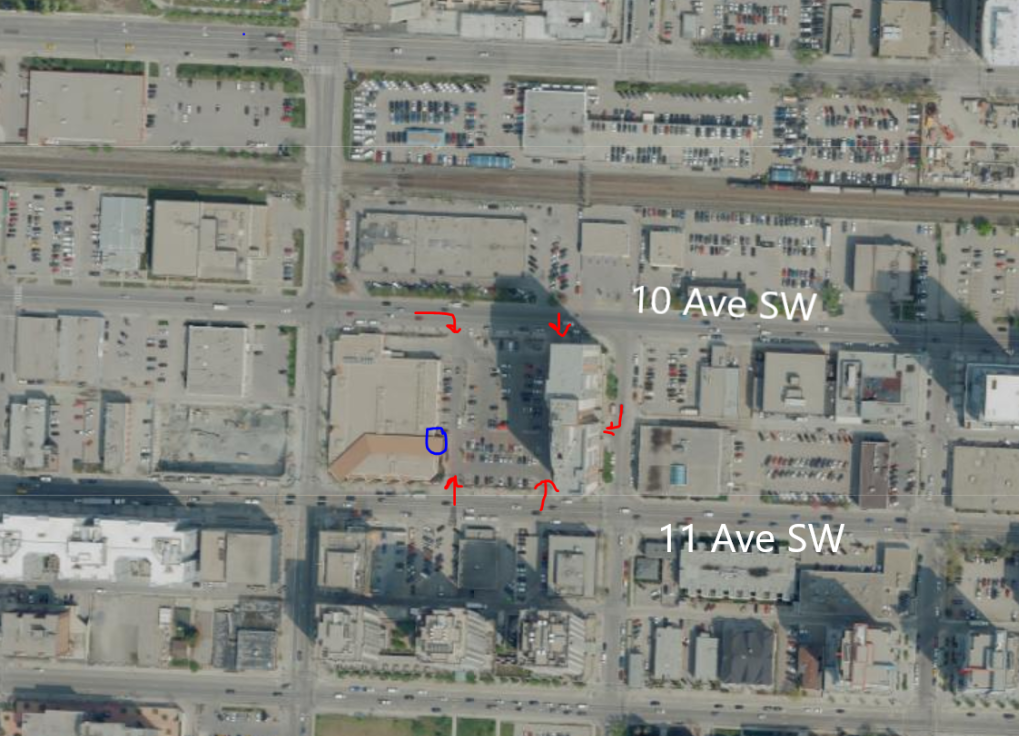
The closest vehicle ramp to the door has the only "sidewalk" to the entrance, however it is obstructed by two near-identical signs to warn you that you can't park overnight on private property as well as the big vehicle overhanging bar. Closer to the entrance, temporary plant racks and signs are setup adding to the congestion. Bonus points for having a bicycle rack in a parking spot - one of Calgary's only examples. Unfortunately at the time of writing the rack has since been moved to the congested narrow part of the "sidewalk". The blue line shows the cut in where the already narrow dedicated pedestrian space is narrowed further. Here almost everything that could be done to ignore pedestrians and pedestrian access has been done, or at least always a lower priority than more signage for parking..
From 11 Street SW looking east (aerial photo): some effort was clearly made to at least acknowledge the urban condition. Wide sidewalks, trees, benches were added here. No entrance at the corner, although if you follow the beige roof feature, it almost looks like they designed it to acknowledge the corner of 11th and 11th, perhaps a long forgotten thought of a future entrance or a faux-architecture nod to how traditional pedestrian-oriented stores work? Again, someone is thinking about urban-format and pedestrians, just not executing in a way that would make a material difference to them. Ironically, the faux-entrance has more pedestrian space that the real one.
From 11 Street & 11 Avenue SW faux-entrance corner: of course there is construction debris in the most recent Google photo, due to the 11th and 11th tower project here : ) Structurally, only complaints are the non-accessible ramp, street light interfering with pedestrians crossing, and the always ubiquitous-in-a-Calgary-sidewalk, the overly large traffic signal control box. Otherwise it's actually nicer than this photo might suggest: trees, largely unobstructed pedestrian footpath, lots of benches that get regular use and has great sun. Not on the list for offensively anti-pedestrian urban intersections.
Lessons:
- Would have been interesting in the design and planning rooms back when this was proposed. You can see the outcomes of what they were trying to do and the tension between their different perspectives: traditional, conservative suburban grocery design + first-in urban redevelopment + mixed use + pedestrians as part of the conversation, but not a priority (still better than most suburban designs at that time IMO)
- It's like pedestrians were acknowledged mostly everywhere except for the only thing you'd think matters - being able to access the store. Obstructions and poor access - even walking from the parking lot.
A different approach:
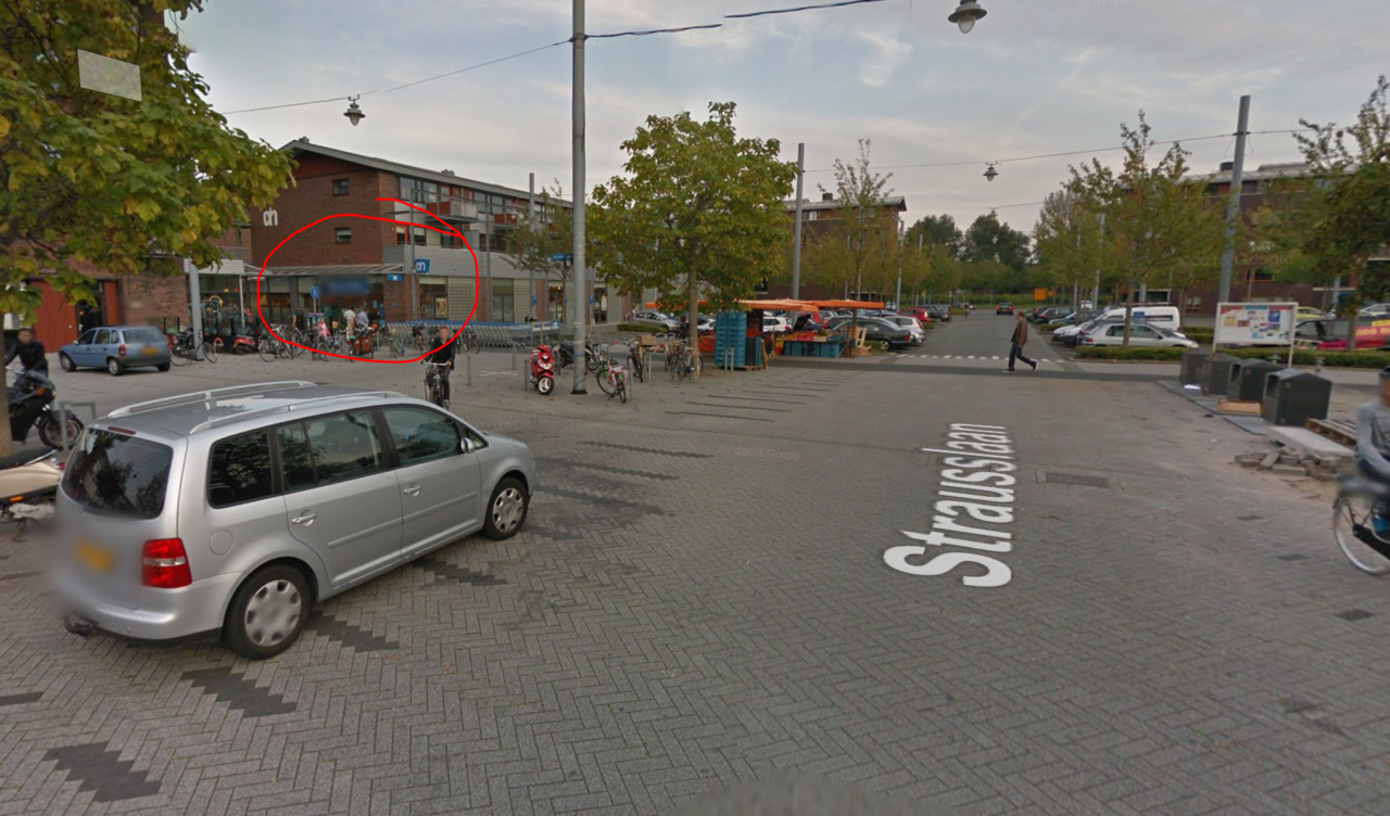
- Here's an example of a suburban grocery store in the Netherlands here. Note that it also "faces inward" by placing it's entrance toward the interior parking lot - which is larger than Co-ops. The whole complex is also mixed use and relatively new. That's probably where the similarities end.
Below is the front entrance to that parking lot circled in red. Note the ample parking for everyone including bicycles (being the Netherlands, of course). No curbs, a giant plaza area immediately outside the area, little if any unnecessary signs or poles except to keep cars out of the walkway immediately near the entrance. The closest parking spot might actually even be *closer* in this this development than in Co-op's example. A residential component is integrated directly above the store as a bonus (I am not even advocating for that, as it's a whole other issue than public realm).
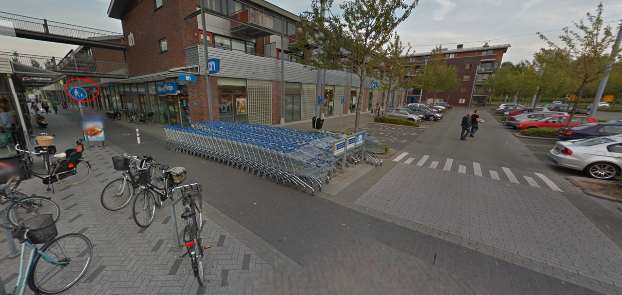
Again, it's the details when it comes to pedestrians. You can make a suburban, car-oriented grocery store with a surface parking lot a hell of a lot better if you actually give pedestrians even a bit more attention and space. The money and development triggered by Co-op could easily afford better treatment (the whole Co-op development probably cost more than the Dutch example with similar density) - but the issue isn't money, good places for pedestrians are cheap. It's about not ignoring the details and having the right values.
