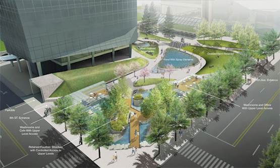
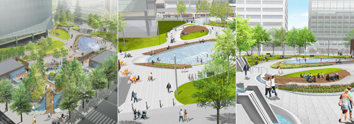
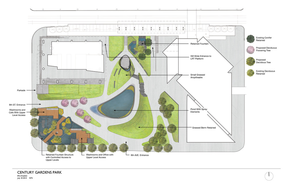
I like the redesign, especially the better sight lines, wider paths, more seating and the new water features. Will be a great asset.
I still feel there is a bit too much organic landscape design going on for a downtown park - curves rather than straight lines, grass for little more than the view etc. Organic designs have seemed to had the grip on Calgary park design for the past decade or two, it's a style I wished was used more sparingly. Sometimes traditional forms are the right approach - even borrow a few pages from the transportation engineers as many of our parks are major connections in the pedestrian and bicycle network.
Riverwalk is a great example of what I am referring to. It is beautiful of course, but the cycle path could have been built straighter and wider for efficiency and capacity. It also could have much better tied into downtown communities rather than almost wall them off with unnecessary flower beds and small, unusable grass patches. It's a park and a transportation corridor (one of the busiest pedestrian and cycle corridors in the city). Some designers seem to really like the top-down curvy look on their computer screens rather than how it actually needs to work from a user perspective. It's not bad, but just seems disjointed and a bit quaint given the context.
Century Park has a bit of this going on IMO. Given the location, I wouldn't have been opposed to a true urban square at Century Gardens, where mobility in all directions are maximized as the expense of curved lines and unusable grass patches. It certainly will be an improvement of course, but seems they could have done a bit more to fit it into it's very urban environment.


