EV Hilton Hotel | ?m | 14s | Widewaters Group | Marshall Tittemore

The black corrugated metal part of the building is extremely ugly. At least the nice white part of the building is in the prominent location, not the black part.
 
The black section is definitely a bit of a miss, but atleast it's not the most prominent part of the building. I don't think this building will be winning design awards, but together with N3 creates a fairly nice block.
 
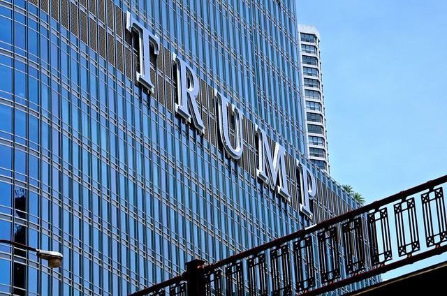
The Twenty-Teens: when people used LEDs, white cladding, and engineered wood entrances in their buildings and giant letters to tell you where you were.

I hate the giant letters trend. I think it's more than just the twenty-teens. I blame companies for mindlessly importing the same signage they use for outlet malls and office parks: large letters pointing directly outward, designed to be visible from the other side of a gigantic parking lot, or from a car speeding off the highway at 80 km/h. In urban contexts, these signs should be designed at a human scale, so that people walking along the sidewalk can see them clearly. That means smaller lettering, closer to eye-level, and signs perpendicular to the front of the building.

Analog Coffee gets it.

Canadian Tire does not. Who is supposed to be reading those gigantic letters, 25 feet above the ground? The only people who have a clear, unobstructed view of the entire sign are the people on the 8th floor across the street.
 
2016 Dec 19 020.JPG 2016 Dec 19 021.JPG 2016 Dec 19 022.JPG 2016 Dec 19 023.JPG 2016 Dec 19 025.JPG 2016 Dec 19 026.JPG 2016 Dec 19 027.JPG

2016 Dec 19 027a.jpg
 

Attachments

  • 2016 Dec 19 020.JPG
    2016 Dec 19 020.JPG
    1.5 MB · Views: 283
  • 2016 Dec 19 021.JPG
    2016 Dec 19 021.JPG
    1.6 MB · Views: 274
  • 2016 Dec 19 022.JPG
    2016 Dec 19 022.JPG
    1.3 MB · Views: 297
  • 2016 Dec 19 023.JPG
    2016 Dec 19 023.JPG
    1.3 MB · Views: 291
  • 2016 Dec 19 025.JPG
    2016 Dec 19 025.JPG
    1.2 MB · Views: 283
  • 2016 Dec 19 026.JPG
    2016 Dec 19 026.JPG
    1.3 MB · Views: 276
  • 2016 Dec 19 027.JPG
    2016 Dec 19 027.JPG
    1.4 MB · Views: 282
  • 2016 Dec 19 027a.jpg
    2016 Dec 19 027a.jpg
    122.1 KB · Views: 274
I like the juxtaposition of the east face of the Hilton with the east face of N3. The dark and white, lots of windows and few windows, works well together I think.
 
I wish they had used that metallic paneling instead of the black corrugated crap. Overall though, it looks better than I thought it would.
 
For the most part it's a good addition to East Village. It'll be good to have that steady activity added to the neighborhood. Same goes for ALT.
 
They left out some important details from the renderings. It's not bad for a chain hotel. I do hope the Alt turns out a whole lot better than this.
 
They left out some important details from the renderings. It's not bad for a chain hotel. I do hope the Alt turns out a whole lot better than this.
The rendering looks a bit different, but what were the important details left out?
 
The main level of the hotel is shown to be even with the sidewalk in the rendering but is raised in real life.
 
Also, the corner section of the tower was shown to be a curtainwall-ish feature but it turned out to have an excess of spandrel.
 
The rendering looks a bit different, but what were the important details left out?

Really? It has a lot more definition. There's awnings and fins and colour that has been replaced by flat, grey spandrel sheets.
 
Ugh. The more I compare the finished product to the original rendering, the less I like it. I hate when buildings do not meet street level. It makes no sense.
 
Well in this case it does make sense, as this area was just completely flooded 3.5 years ago. It's the same reason that the RioCan Retail block will have steps up to it as well.
 

Back
Top